How to use causal influence diagrams to recognize the hidden incentives that shape an AI agent’s behavior.
There is rightfully a lot of concern about the fairness and safety of advanced Machine Learning systems. To attack the root of the problem, researchers can analyze the incentives posed by a learning algorithm using causal influence diagrams (CIDs). Among others, DeepMind Safety Research has written about their research on CIDs, and I have written before about how they can be used to avoid reward tampering. However, while there is some writing on the types of incentives that can be found using CIDs, I haven’t seen a succinct write up of the graphical criteria used to identify such incentives. To fill this gap, this post will summarize the incentive concepts and their corresponding graphical criteria, which were originally defined in the paper Agent Incentives: A Causal Perspective.
A causal influence diagram is a directed acyclic graph where different types of nodes represent different elements of an optimization problem. Decision nodes represent values that an agent can influence, utility nodes represent the optimization objective, and structural nodes (also called change nodes) represent the remaining variables such as the state. The arrows show how the nodes are causally related with dotted arrows indicating the information that an agent uses to make a decision. Below is the CID of a Markov Decision Process, with decision nodes in blue and utility nodes in yellow:
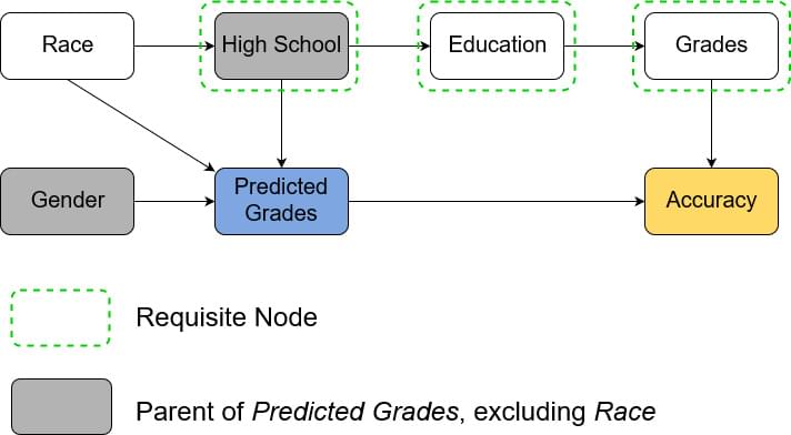
The first model is trying to predict a high school student’s grades in order to evaluate their university application. The model uses the student’s high school and gender as input and outputs the predicted GPA. In the CID below we see that predicted grade is a decision node. As we train our model for accurate predictions, accuracy is the utility node. The remaining, structural nodes show how relevant facts about the world relate to each other. The arrows from gender and high school to predicted grade show that those are inputs to the model. For our example we assume that a student’s gender doesn’t affect their grade and so there is no arrow between them. On the other hand, a student’s high school is assumed to affect their education, which in turn affects their grade, which of course affects accuracy. The example assumes that a student’s race influences the high school they go to. Note that only high school and gender are known to the model.